Application for student aid
In collaboration with Centrala Studiestödsnämnden (CSN), this bachelor degree project has been to investigate the current application service for study funds using a design process with the user in focus. The aim has been to create a more uniform application service that will improve the possibility of applying for study funds.

CSN is the authority in Sweden responsible for managing student financial aid loans. Everyone in Sweden has the opportunity to pursue their studies with the help of student financial aid, regardless of their social, economic,
or geographical background. Student financial aid and CSN contribute to the knowledge society and a strong national economy.
“Create a more cohesive application service that enhances the ability to apply for student financial aid, specifically for prospective university students studying in Sweden, with a focus on their experience as first-time applicants."
The problem:
The application form for applying for student financial aid is a lengthy and complex process with many components. This means that the applicant needs to read a lot of information about the rules regarding student financial aid on the website in order to complete the application form.
The solution:
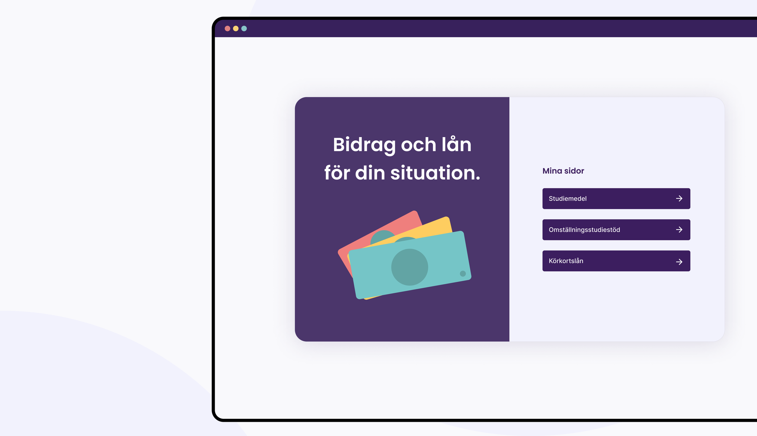
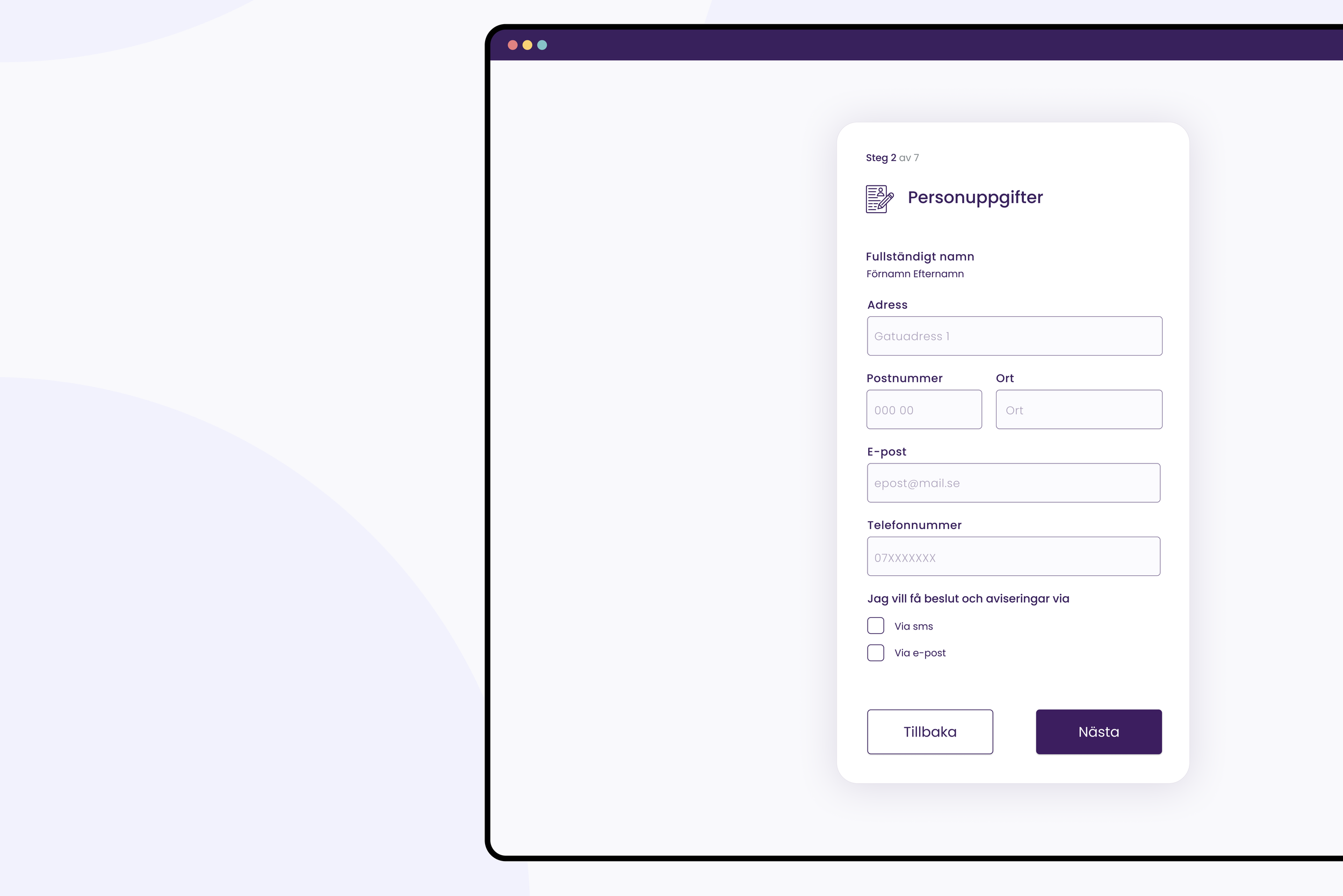
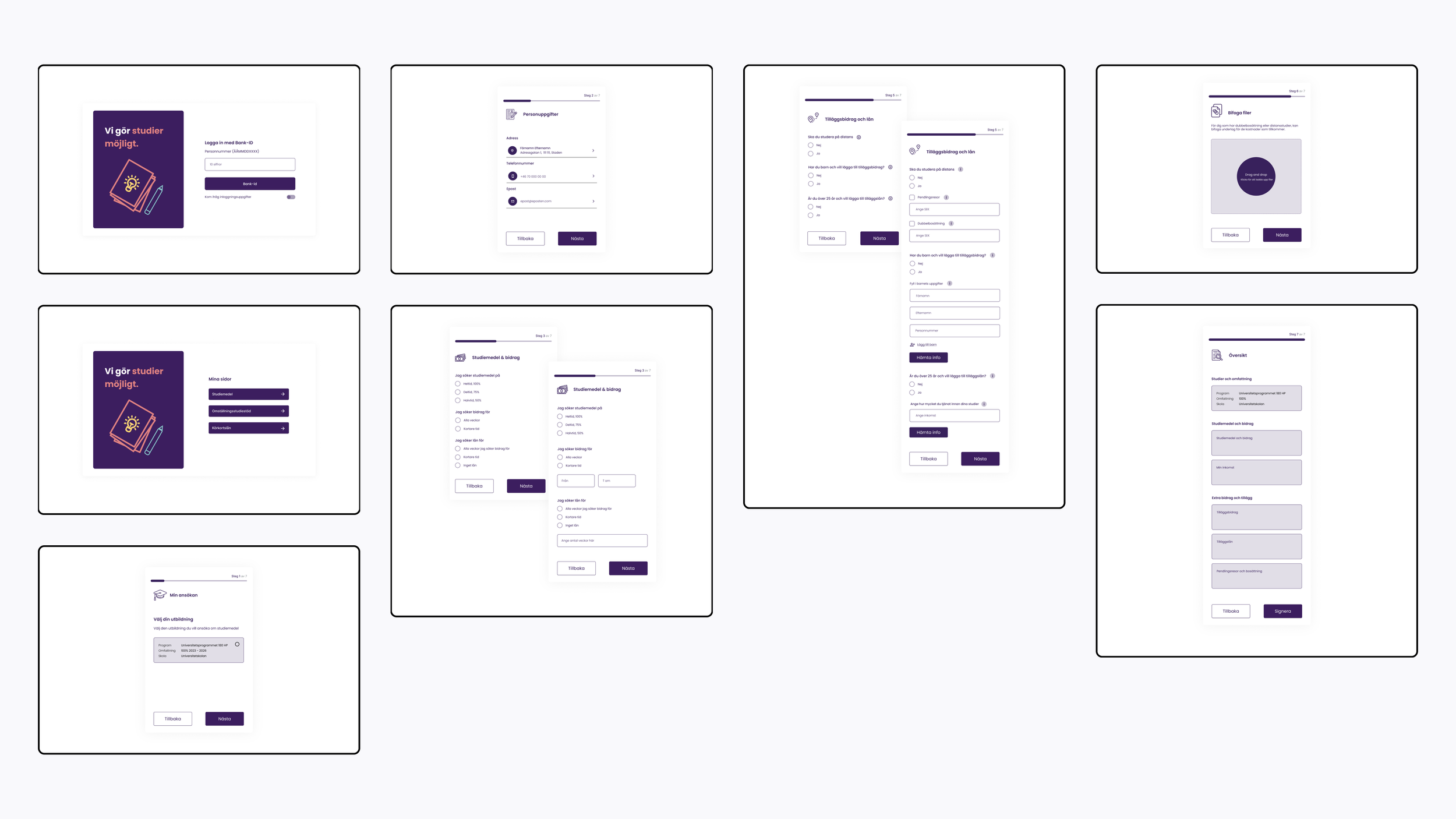
The project resulted in a new responsive application form designed to work across various devices, including computers, tablets, and phones. The student financial aid application process was streamlined by reducing the number of steps from 9 to 7, enhancing the user experience, simplifying the process for first-time applicants. Improved interface readability was achieved by incorporating CSN's purple color scheme, illustrations, and symbols linked to headings, making the application process more intuitive. Contrast between the form and the background was increased to minimize distractions, and unnecessary text was trimmed for a clearer focus.
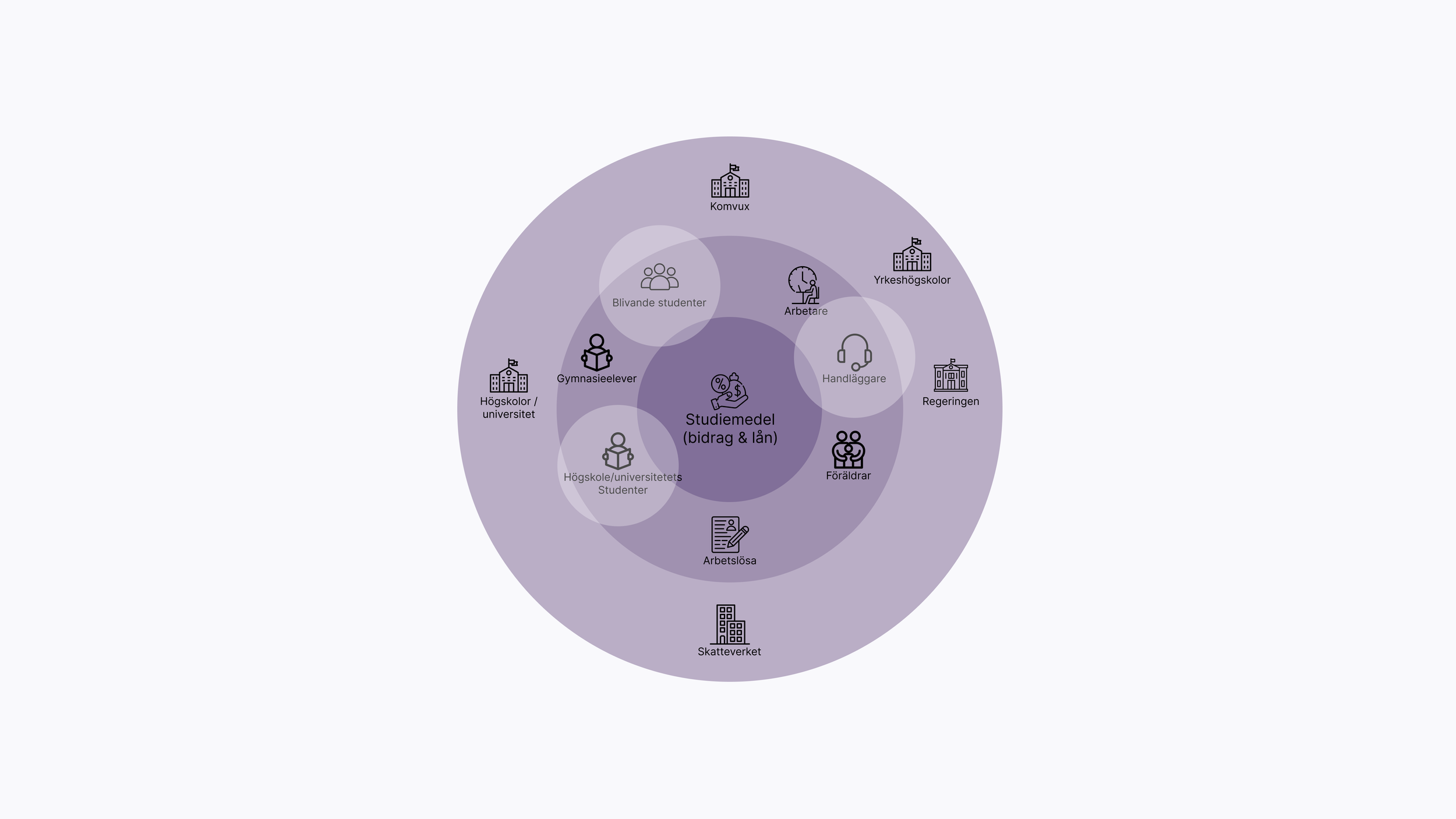
Stakeholdersmap
To understand which actors are involved in loans and grants, an actor map was visualized. Those enclosed in the actor map are the group focused on in this project for service development. University students to gain insight into their experience and administrators to understand their perspective on the service. By identifying the needs of this group, it will in turn lead to a service aimed at simplifying the application process for prospective students.
Flowchart
The research began with an initial phase where an analysis of the existing process for applying for student aid was conducted. By understanding how the service is structured, the service was mapped using a flowchart. The map is based on the structure of the application process flow.
The application process consists of 9 different steps, where each student needs to manually navigate through several sub-steps within certain parts of the process. Within step 1, there are 3 sub-steps related to school and education, study period and scope, as well as my schools and education. Within step 2, there are 4 sub-steps for my grants and loans, additional grants, additional loans, and special needs loans. Step 3 contains 1 sub-step for my income during the study periods. Step 4 encompasses 2 sub-steps for address details, contact information, and mailings. In the remaining steps 5, 6, 7, 8, and 9, there are options to add attachments, provide additional application information, review details, sign, and confirm. As an applicant, you need to go through a total of 15 different steps before the application is submitted, followed by approximately 14 days of waiting for the decision to be issued.
Survey & interviews
A survey was contucted to gain a broader understanding of the needs and preferences regarding how CSN's current application service functions today. The survey consisted of 7 questions and generated a total of 31 respondents.
The survey provided clearer and broader insights into the current experience of the service and its potential for improvement. This data provided a more definite direction for further information gathering through interviews.
The survey was followed up by qualitative interviews with two administrators who work with the processing of student aid applications and six students who have recently been in contact with the student aid application process. Unstructured interview techniques were applied.
Results:
Length and Repetition: Many respondents found the application process to be excessively long and repetitive. They suggested that information that could be pre-filled should already be provided.
Outdated Interface: A common complaint was that the form's interface appears outdated and requires a modern redesign.
Clarity of Help Buttons: Respondents expressed a need for clearer and more prominent help buttons within the application.
Difficulty Reading and Concentrating: Several participants mentioned experiencing difficulties with reading and concentrating during the application process. This caused them to perceive the process as anxiety-inducing.
Complexity: Many respondents found the application process to be long and complicated. They pointed out issues such as small text and small boxes that were challenging to understand.
Hierarchy and Symbols: Users indicated that the hierarchy of the form was confusing, and they suggested the inclusion of semiotic symbols to improve comprehension.
Concentration Issues: A recurring theme was the tendency to easily lose concentration while completing the application.
Uncertainty: Respondents expressed feelings of uncertainty during the application process.
Personas
Two personas were created based on the collected information from surveys, interviews, and user journeys. Within the group applying for student loans, there is a diversity of conflicting perspectives, life experiences, and knowledge, where the service's content is interpreted and experienced differently through emotions and reactions. Many people spend a long time completing the application process, while others spend a shorter time and submit their applications quickly.
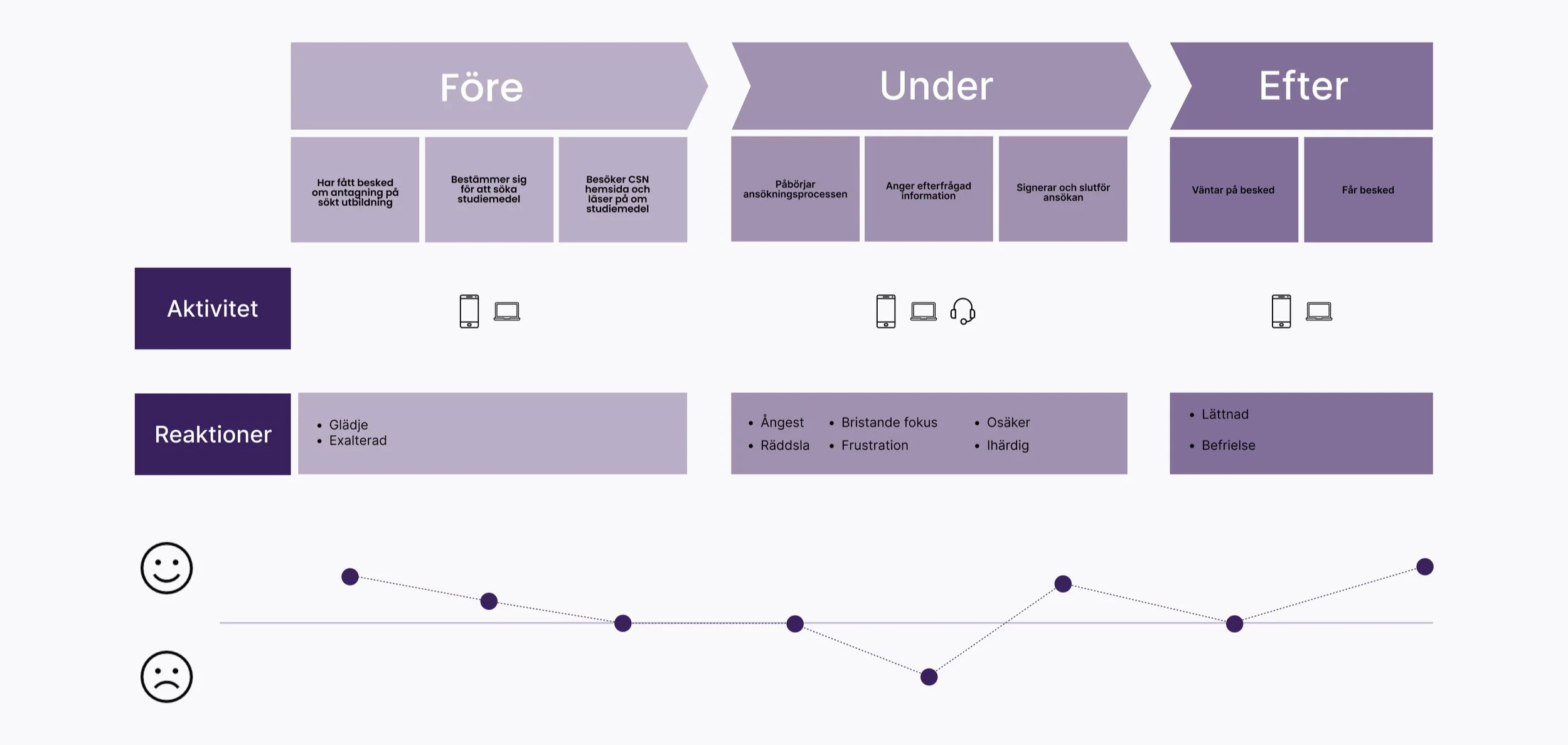
Customer journey map
Based on the quantitative and qualitative research conducted through surveys and interviews, the user journey for the application for student loans was mapped from a first-time applicant's perspective. Using this method, pain points in the current application process were identified. From the gathered information, it is evident that it is during the process that the user experiences the most reactions such as frustration, anxiety, and uncertainty. It is also where the emotional graph is at its lowest due to the circumstances encountered by the applicant during the current application process. By understanding how the service is currently perceived, the goal is for the experience of the concept for first-time applicants to have a positive feeling from beginning to end.
Concept
Three different lo-fi design concepts were created based on the collected data.
User test concept 1-3
To gain an understanding of how these three concepts were perceived, 5 user tests were conducted where each test participant performed usability testing on each concept idea. The test involved the participant being tasked with applying for student aid for the first.
Result:
Concept 2 and Concept 3 were favored by most users for their user-friendliness.
Users noted that the presence of symbols reduced the need to search for help information.
Allowing users to answer questions directly helped them filter out less relevant information.
Users appreciated having a clear indication of their progress in the process.
Concept 4
From all the feedback gathered in the user tests, a new concept, Concept 4, was developed. By incorporating a login page and the option to choose loans and grants, a more clear-cut user experience was crafted from start to finish. Concept 4 is a fusion of the most appreciated aspects of Concepts 2 and 3 from earlier user tests. It was created by using the question form from Concept 2 and integrating symbols from Concept 3. Additionally, a purple color from CSN's visual identity was introduced to enhance the visual interface of the concept.
User test concept 4
User testing was conducted with 5 individuals.
By ensuring that the concept was more user-friendly, a hi-fi interactive prototype was created, allowing the user to click around and experience it in a more realistic manner.
Prototype
Final concept
User test results:
Users no longer felt uncertain during the application process.
The amount of information was considered just right, aiding concentration throughout the entire application process.
Information buttons were clear and provided comfort for users who didn't understand certain steps.
The number of steps in the process was perceived as reasonable, and it was easy to determine the current step.
Users appreciated the updated interface, which created a more enjoyable experience when applying for student aid.
Symbols in the concept were well-received and helpful, but users suggested they could be minimized slightly.
To enhance readability, users recommended increasing the contrast between the form and the background, as it previously blended into the background.
Hierarchy and font size for headings and subheadings were suggested to be clarified to avoid confusion for applicants.


